Description
Any model architecture can be visualized with the filters of any layer. Only the initial layers are comprehensible using the technique. The last layer is useful for the nearest neighbor approach. The ImageNet dataset, when arranged with nearest neighbors, looks as follows:
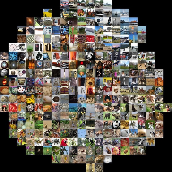
Looking at this image, you can see that the same objects appear together. One of the interesting things is that the animals such as the dog, monkey, and cheetah appear together though they are not trained under one label. Nearest neighbour visualization of the images is useful when objects are similar and hence, we can understand the model’s predictions. This last layer can also be visualized by dimensionality reduction techniques, such as principal component analysis and t-SNE. We will see the implementation for visualization using dimensionality reduction in the next section.

Reviews
There are no reviews yet.